Most webinar landing pages don’t fail because the topic is bad.
They fail because the page doesn’t guide people to take action.
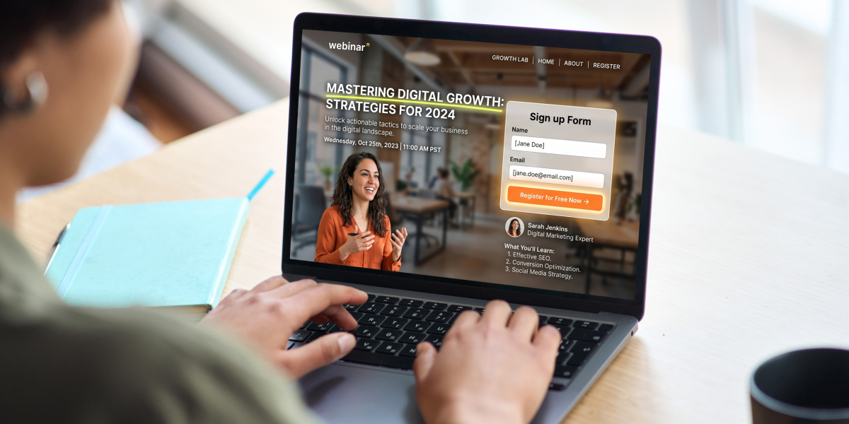
You set up a webinar. You pick a strong webinar title. You send traffic from social media, LinkedIn, or your email list. But when website visitors arrive on your webinar registration page, they hesitate.
They scroll. They skim. Then they leave without signing up.
That gap between interest and action is where most webinar pages quietly fail and where you lose leads you should have had.
The good news is this is not a traffic or webinar software problem. It is a structure and messaging problem. Once you fix that, you can optimize your conversion rate and improve attendance rates across your funnel.
In this guide, you’ll learn how to build a webinar landing page that turns potential attendees into registrants using simple structure, clear copy, and proven webinar marketing principles.
| Struggling to get people to register in the first place? If you’re not sure what to say on your page, this is where most people get stuck. The Registration Page Copy Blocks give you the exact words to fix that.Inside WebinarJam Kit, you’ll get plug-and-play frameworks for your landing page, plus the full system behind creating a successful webinar. |
What a Webinar Landing Page Is (And What It Needs to Do)
A webinar landing page is the moment where interest turns into a lead or disappears completely.
Convert website visitors into leads. That’s the goal.
It’s a core part of your lead generation system and often the first step in a successful webinar funnel.
This is not your homepage. It is not a full content marketing hub. It is a single, focused page designed to get someone to sign up for your upcoming webinar or on-demand webinar.
If your page tries to do too much, it creates confusion. And confused visitors don’t convert.
The goal isn’t to explain everything. It’s to make the decision feel easy. Clearly communicate the value proposition and give just enough key details for someone to say yes.
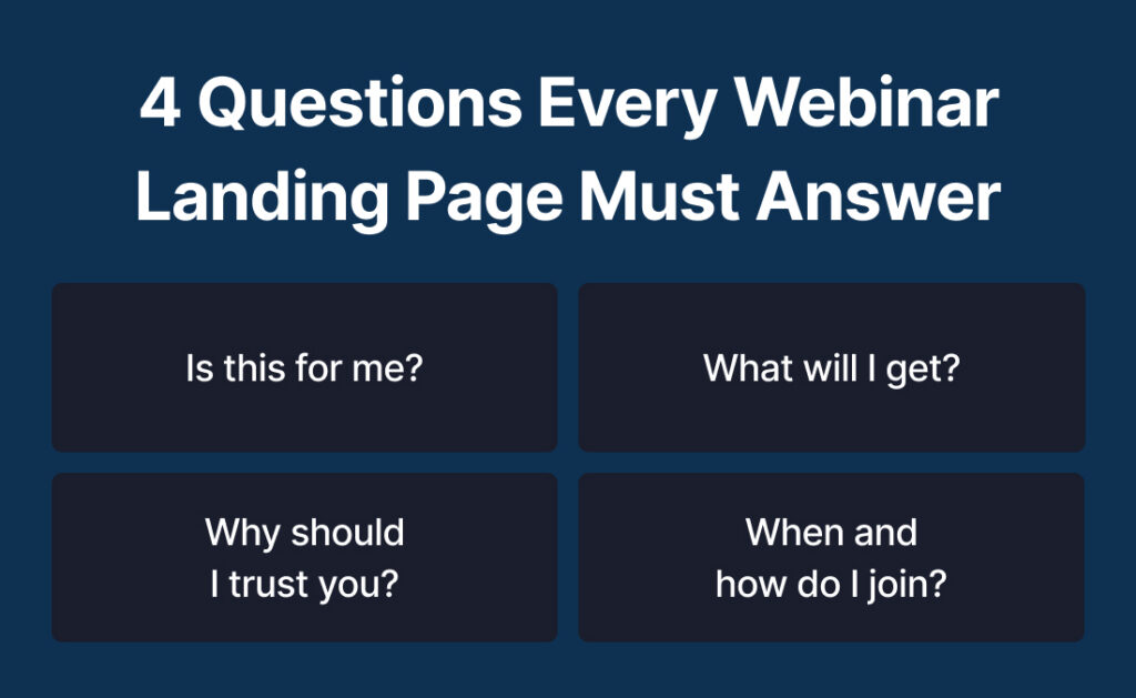
The 4 Questions Every Webinar Landing Page Must Answer
Every high-converting webinar landing page answers four key questions quickly.
Is this for me?
Make your target audience clear so the right people lean in.
What will I get?
Highlight the takeaways and outcomes, not just the webinar topic.
Why should I trust you?
Use credibility elements like testimonials or experience.
When and how do I join?
Clarify whether it’s a live webinar or on-demand webinar and how to access it.
When these answers are clear, your signup form converts better and your attendance rates improve.
The Anatomy of a High-Converting Webinar Landing Page
A strong landing page follows a structure that matches how people read online.
Most users skim. Especially on mobile devices.
That means your layout, font choices, and spacing all matter. Your page should feel easy to scan and visually clear, even if you are using a simple landing page builder.
Above the Fold: Hook and Capture Attention Fast
This is the first section people see.
It needs to be clear and eye-catching without being overwhelming.
Include:
- A strong webinar title focused on the result
- A short subheadline that supports the value proposition
- A visible CTA (call-to-action) button
- A clean header section with minimal distractions
If you want to increase urgency, you can also include countdown timers here to create a sense of FOMO.
Your headline and header section do most of the work. If they don’t connect, visitors won’t scroll.
The Core Promise: Why This Webinar Is Worth Their Time
Once you have attention, you need to build interest.
This is where your value proposition becomes clear.
Avoid listing topics. Focus on outcomes and takeaways.
Use bullet points like:
- Learn how to stop feeling exhausted by 3pm and create a simple daily routine that actually gives you energy
- Discover how to finally stay on top of your workload without working late or feeling constantly behind
- Understand why your current habits aren’t sticking and what to change so you can follow through consistently
If your bullet points sound like something any webinar could say, they won’t convert. They should feel like they were written for one specific person with one specific problem.
The Credibility Layer: Why They Should Trust You
Trust removes hesitation.
You don’t need a long bio. Just enough proof.
Include:
- A short speaker bio
- High-quality headshots
- Relevant experience or results
- Testimonials if available
If you’ve worked with known platforms like HubSpot or integrated tools through your CRM, you can mention that briefly as well.
This builds confidence without overwhelming the reader.
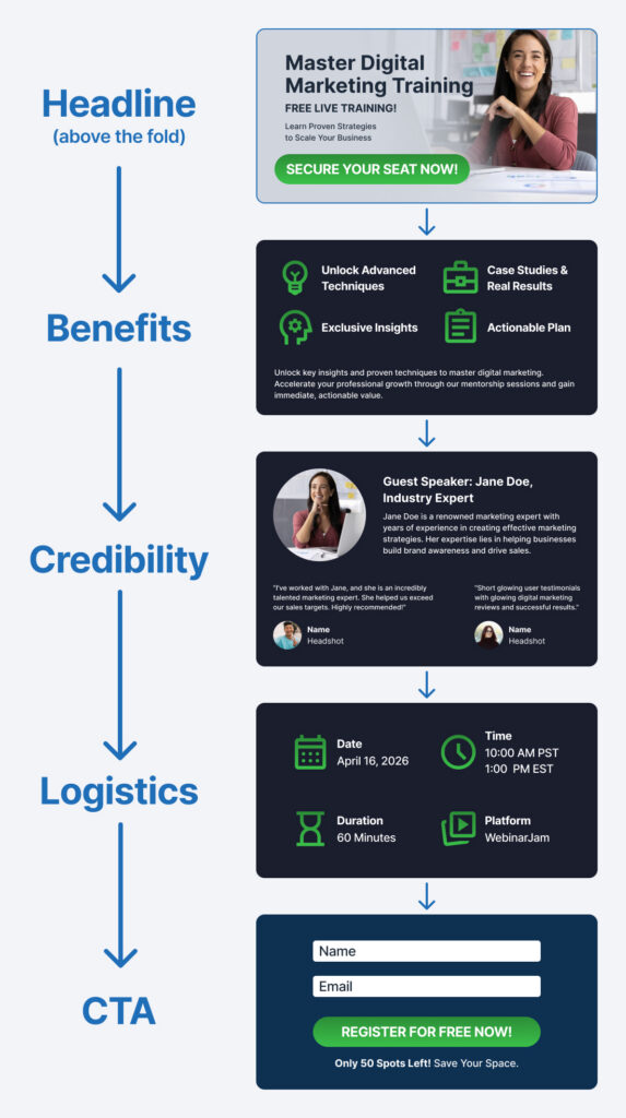
The Logistics Section: Remove Uncertainty
When people aren’t sure what happens next, they delay the decision or leave.
Make it easy for potential attendees to understand the key details.
Include:
- Date and time for a live webinar
- Access details for an on-demand webinar
- Duration and format
- Whether there will be Q&A or extra resources
If you use a webinar platform with integrations, you can also mention calendar syncing or CRM connections to reinforce ease of use.
The Conversion Close: Make Signing Up Easy
This is where conversion happens.
Your registration form should be simple and fast to complete.
Best practices:
- Keep the signup form short
- Ask only for essential information
- Use a clear CTA like “Save my spot”
A complicated registration form lowers conversions. A simple one increases lead generation.
How to Write a Webinar Landing Page That Actually Converts
Structure gets people to read. Copy is what makes them decide.
Even the best webinar landing page templates won’t perform if the messaging is weak.
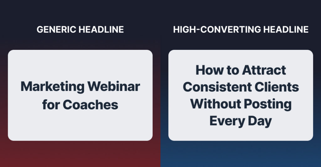
Write a Headline That Focuses on Outcome, Not Topic
Most webinar landing page examples fail here.
They describe the topic instead of the result.
Compare:
Marketing Webinar for Coaches
vs.
How to Attract Consistent Clients Without Posting Every Day
The second one is clear and outcome-driven.
You can use simple frameworks:
- How to [achieve result] without [common problem]
- The simple way to [desired outcome] even if [objection]
A strong webinar title improves both SEO and conversions.
Use Benefit-Driven Bullet Points (Not Generic Agendas)
Your bullet points should sell the transformation.
Instead of listing topics, highlight outcomes.
For example:
- Build a simple weekly routine so you stop feeling overwhelmed and actually finish what you start
- Learn how to stay focused during the day without constantly getting distracted or losing momentum
- Discover what’s been throwing off your schedule and how to fix it so your days feel more under control
Clear takeaways help visitors see the value quickly.
Remove Friction With Clear, Simple Copy
Your page should feel easy to read.
Use:
- Short paragraphs
- Simple language
- Clear transitions
Avoid unnecessary jargon. Even if your audience is experienced, clarity wins.
Also make sure your page looks clean on mobile devices. Many visitors will view your webinar landing page on their phone.
Make Your CTA About Them, Not You
Your CTA should reinforce value.
Weak:
- Submit
- Register
Stronger:
- Save my spot
- Get instant access
- Join the training
Small changes here can improve your conversion rate considerably.
| Your copy is the biggest conversion lever on your page. If your messaging feels off, even the best design won’t fix it.These copy blocks show you exactly how to fix it.Plus, access the full system that drives sign-ups, show-ups, and sales. |
The Biggest Mistakes That Kill Webinar Sign-Ups
Even strong offers fail when the page is not optimized.
Here are the most common issues.
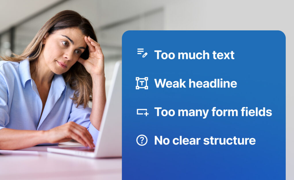
Trying to Say Too Much
Long pages are not always better.
If your content feels overwhelming, visitors leave.
Focus on what matters most.
Leading With Features Instead of Outcomes
Your audience cares about results.
Always connect your messaging to what they will gain.
Weak or Generic Headlines
Your headline is the first impression.
If it is not clear, the rest of the page does not matter.
Too Many Form Fields
Every extra field adds friction.
Keep your registration form simple.
No Clear Flow or Structure
A good webinar landing page guides the reader.
If your layout feels random, conversions drop.
How This Fits Into Your Full Webinar Funnel
Your webinar landing page is one part of your webinar marketing system.
A typical funnel includes:
- Traffic from social media, LinkedIn, or content marketing
- Webinar registration page
- Attendance and engagement
- Follow-up emails
- Offer and conversion
If one step breaks, especially your landing page or follow-up, the entire webinar can feel like a waste of time.
Why a Great Landing Page Isn’t Enough on Its Own
You can have a high-converting page and still struggle.
If people don’t show up, all the work you put into the webinar goes nowhere.
If there is no follow-up, leads go cold.
If your offer is unclear, conversions drop.
The landing page captures the lead. The rest of the system turns it into revenue.
The 4-Part Webinar System
To create a successful webinar, you need a simple system.
This includes:
- A way to improve attendance rates
- A follow-up process that builds trust
- A clear offer structure
- A high-converting webinar landing page
Many webinar platforms and webinar software tools allow you to automate parts of this process, including follow-ups and integrations with your CRM.
A Simple Framework You Can Use to Build Your Page
If you are starting from scratch, you don’t need complex tools.
You can use simple webinar landing page templates inside most landing page builder tools.
Step 1: Define the Core Outcome
Start with the result your webinar delivers.
Be specific. This becomes your value proposition.
Step 2: Write the Headline and Subheadline
Your headline sets the direction.
Test different variations if needed. You can even A/B test headlines to see what improves conversions.
Step 3: Add 3 to 5 Outcome-Based Bullet Points
Keep them focused on benefits and takeaways.
This is where you build interest.
Step 4: Add Trust and Logistics
Include testimonials, headshots, and key details.
Keep it concise.
Step 5: Keep the Page Clean and Focused
Remove distractions.
Use simple design, clear font choices, and consistent spacing.
Example: Simple Webinar Landing Page Structure
Looking at webinar landing page examples can help, but simplicity is often the best approach.
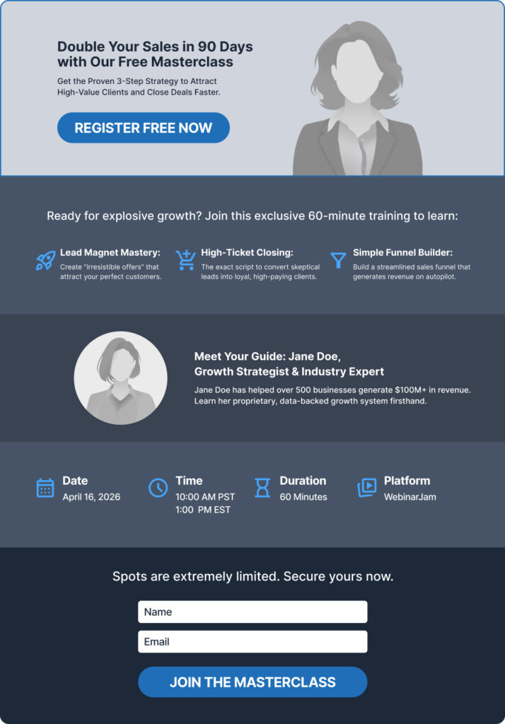
Sample Layout
- Headline focused on the result
- Subheadline with clear value proposition
- CTA button above the fold
- Benefit-driven bullet points
- Speaker bio with headshots
- Key details about the webinar
- Simple signup form
- Final CTA
You can build this using most webinar landing page templates or embed it into your website if your platform allows it.
If your page follows this structure, you’re already ahead of most webinar landing pages online.
| If you don’t want to spend hours guessing what to write, use the templates that already work. Use proven webinar landing page templates and copy blocks designed to convert.Inside WebinarJam Kit, you’ll also get the Show-Up System, Follow-Up Engine, and Offer Stack Builder to turn registrations into real results. |
Final Thoughts: Keep It Simple, Clear, and Focused on Results
You don’t need more tools or more complexity. You need a page that makes the right person say yes without hesitation.
You need clarity.
Focus on:
- A strong, outcome-driven webinar title
- Simple, benefit-focused messaging
- A clean structure that guides decisions
Then test and optimize over time.
As you improve your webinar landing page, you’ll generate more leads, increase attendance rates, and build a more effective webinar marketing system that supports your growth.
| Ready to turn your webinar into a consistent lead generation system?WebinarJam Kit gives you the complete framework:Show-Up System to boost attendanceFollow-Up Engine to convert leadsOffer Stack Builder to increase salesRegistration Page Copy Blocks to improve sign-upsEverything you need to run profitable webinars on repeat. |